This Type Logo project was inspired to me after being recently introduced by my business partner to the works of Graphic Designer Aaron Draplin. An absolute character based in Portland, Oregon, USA.
I became envious of the passion that Draplin has for his home city, and was inspired to create a logo type based on the town in which I live and have done so all my life.
I became envious of the passion that Draplin has for his home city, and was inspired to create a logo type based on the town in which I live and have done so all my life.
Draplin's technique was to take a font in it's default setting and play and manipulate it's kerning, leading and spacing to form interesting relationships with each letter. To create new exciting shapes and develop the default text into a work of art.

In this presentation I use the same technique to show you the journey the type logo took from it's default to it's final design.
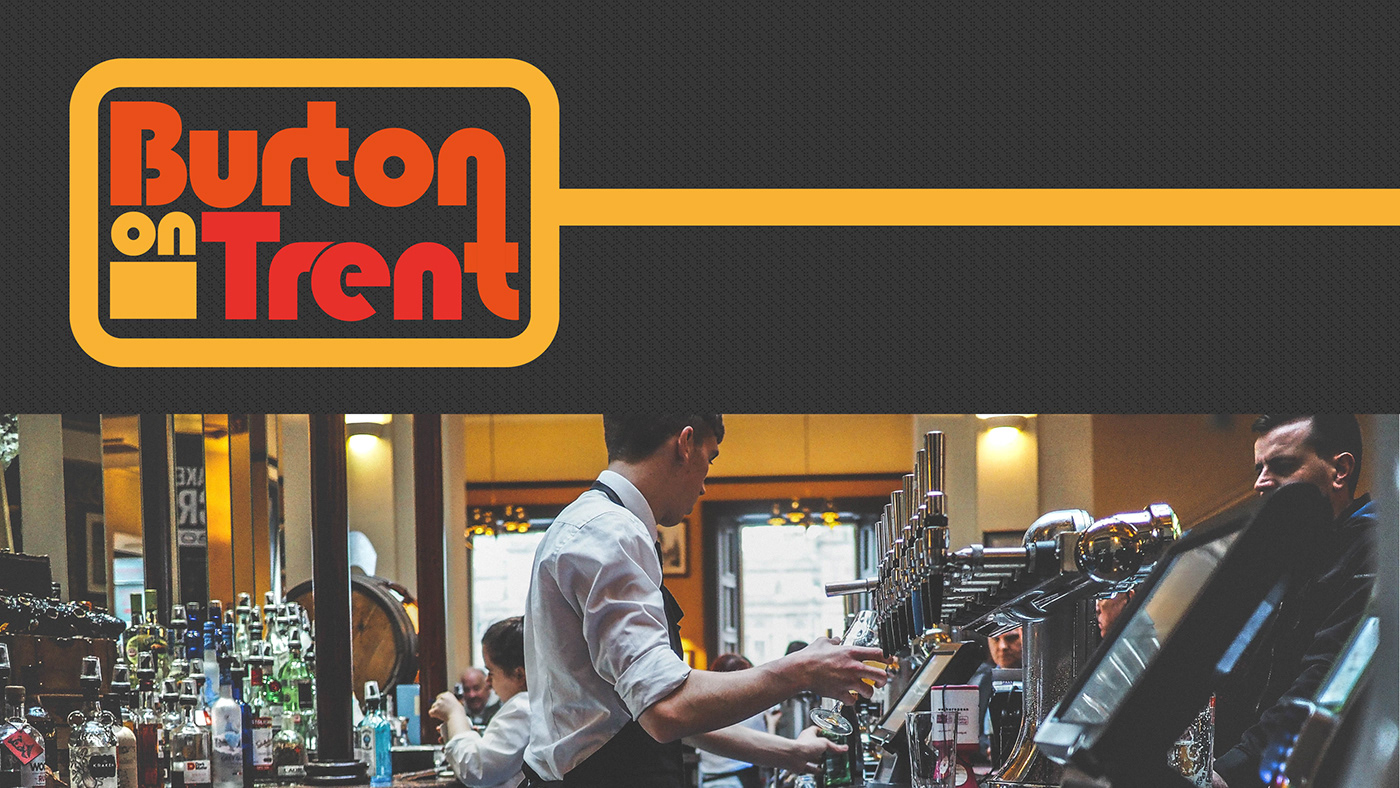
Burton on Trent the town where I live is famous for his brewing industry. It's currently home to Coors who are known for creating the Carling lager brand. The town also has it's own football team and has many great nature spots due to being situated on the Trent river.
The finished type logo I created gave me a sense of nostalgia due to it's style of typography design found it the 1980's. I believe many will agree that the town of Burton on Trent isn't what it once was due to many different economical factors over the decades.
A number of industries that once gave the town life and excitement have come and gone.
A number of industries that once gave the town life and excitement have come and gone.
However by pairing the design I created to images that connect to Burton's herritage, it allowed me to reflect on the place I live and I believe this is the same goal that perhaps Draplin has for the place his lives too when he creates his own typography designs.